| 4. How did you integrate technologies- software, hardware and online in this project? My whole project was technology based, starting from software and Online platforms,Google Chrome browser and My very own media studies blog on weebly which i used as foundation for displaying my journey through this project. Secondly Adobe Photoshop was the most important of the software's that i used to develop and create my magazines. From the preliminary task magazine to the final Foundation portfolio magazine I learned a lot and gained many skills from this software. I learned about masking layers and adding effects to them to create a deeper meaning and using tools such as the Blur tool and the burn tool as well as effects such as the Posterize effect. Photoshop allowed me to enhance my creativity and give life to my ideas. I also used Prezi.com to make presentations to present my research and planning and Microsoft Powerpoint as well. I also used Microsoft Word to make my magazine layouts and Survey monkey for conducting my survey on the contents of the magazine. The Hardware I used was Viper All-in-one Pc and Dell Inspiron N5110 laptop as computers, both these were capable and fast enough to run all kinds of software that i required, The camera i used for my photo-shoots was Canon EOS 550D apart from this i used Tripod as well for some camera shots. Most of my work was software related and this is how i used technologies in making my project. | 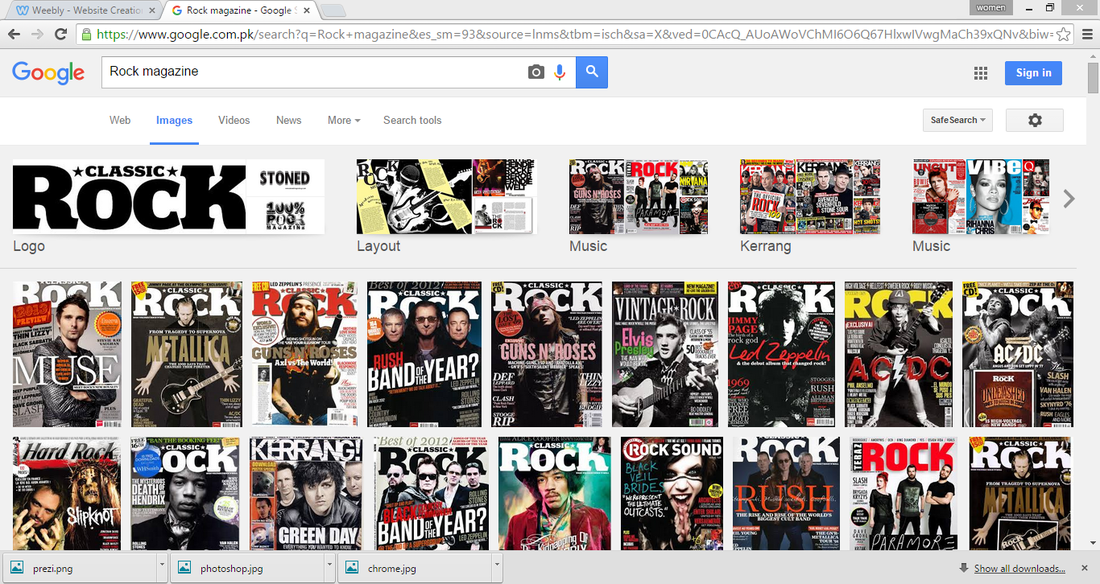  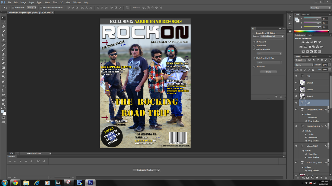   |
|
0 Comments
 1. How does your product use or challenge conventions and how does it represent social groups or issues? My music magazine represents Rock bands as it is a rock magazine. My magazine challenges the conventions set up by rock music magazines, the typical and conventional representation of rock stars as rebels with full tattooed bodies and dark appearances with Gothic and black color based wardrobe is not the representation i wanted to display because I believe that such conventional representation is only the representation of particular rock genres like Metal and Hard rock, my magazine shows how adventurous and lively rock stars are as it features a road trip and a rock band on a journey touring main cities. The band members are not completely unconventional as they do fulfill some conventions, such as the vocalist wearing a shirt with a wolf printed on it, showing how wild and untamed he is, in the same way all members are wearing jeans, sunglasses and rock star jewelry, such as bands and chains but to a limited extent as I didn't want to overdo it, and at the same time i didn't give my band a dark anti establishment and Gothic look because here i wanted to be unconventional like U2 or Bonjovi (present). This is how my magazine challenges conventions, but at the same time it follows several conventions such as that of the sequence of the magazine and placing of Masthead, and cover lines as well as the main image placement and the Camera shots of the band featured  For the second part of the question, my magazine represents people with a slightly mature taste in rock music, such as those who are 20 or above till 35 years, it does not feature Boy-bands and conventionally features Male artists on the cover. The band i have featured (GRAFFITI) in my magazine also belong to the same age group, They are represented as serious and committed, not making any rebellious gestures as i have given a 'U2' inspired representation. This shows that the social group represents mature people who take meaning from rock music and do not listen as rebels but go deeper and find meaning in the music they listen, an approach that is quite unconventional in magazine representation but highly present in the real world.
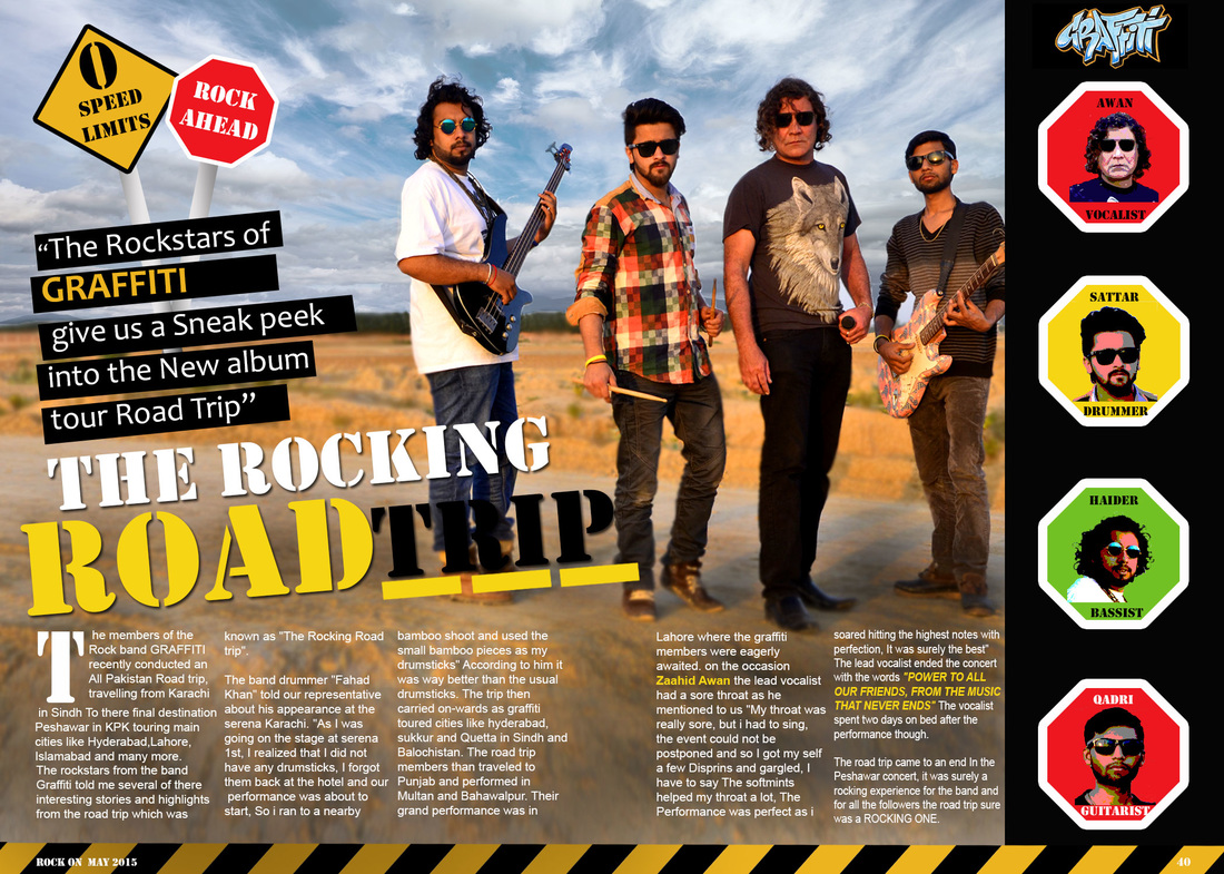  For my Revised Double page spread I made use of several available effects such as the Posterize effect which I used on the pictures of the band members on the right column 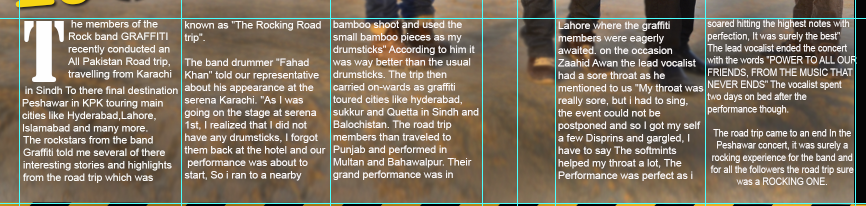 I also rearranged the text columns and made them more Uniform and equal in height and width for this i created a grid first and then added the text and also changed the color scheme of the body text to just white and black and slightly burned the background to make the text more visible and prominent.  I also added a background box to the description of the Main Anchoring text to make it look more prominent and aesthetically attractive. I also created a new layer of the sky in the background and then added effects to it and increased the contrast to make the clouds more visible and give them more detail because without these effects the background was looking very dull and plain.
These are some of the changes I made to the Final Double page spread to come up with a final Revised magazine double page spread.  I did not make many changes to the Contents page, I just added a young talent section in which I added a picture I took of one of my school friends while she was performing at an event.
I rearranged certain elements such as the page number and removed the silhouettes behind the contents. 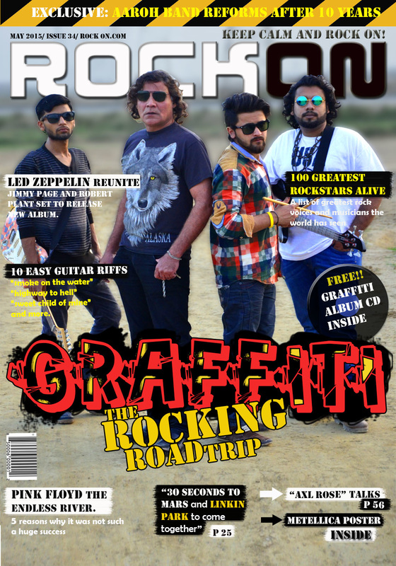 After producing a final Magazine cover page, I discussed it with my teacher about how to make it better and he made me realize that I had missed one of the most important Conventions of a Music magazine which is the Featured band's name, so after researching into this i added the band name and also added graphic elements and 3d effects to it using layer duplicating and coloring the shadow and writing the band name in a "Graffiti" font that i downloaded online. I also used the spray tool to give an inner glow to the band name to actually make it look like it was a Graffiti tag as well.
I also made other changes and rearranged items to make the cover page look more interesting and I also gave the cover lines a background using the brush tool. Finally after making these changes, I am satisfied with my Revised Final Cover page. I took Screenshots via the snipping tool while I was making my final magazine. Kindly click on the images to open the Gallery and read the picture description in the Captions. 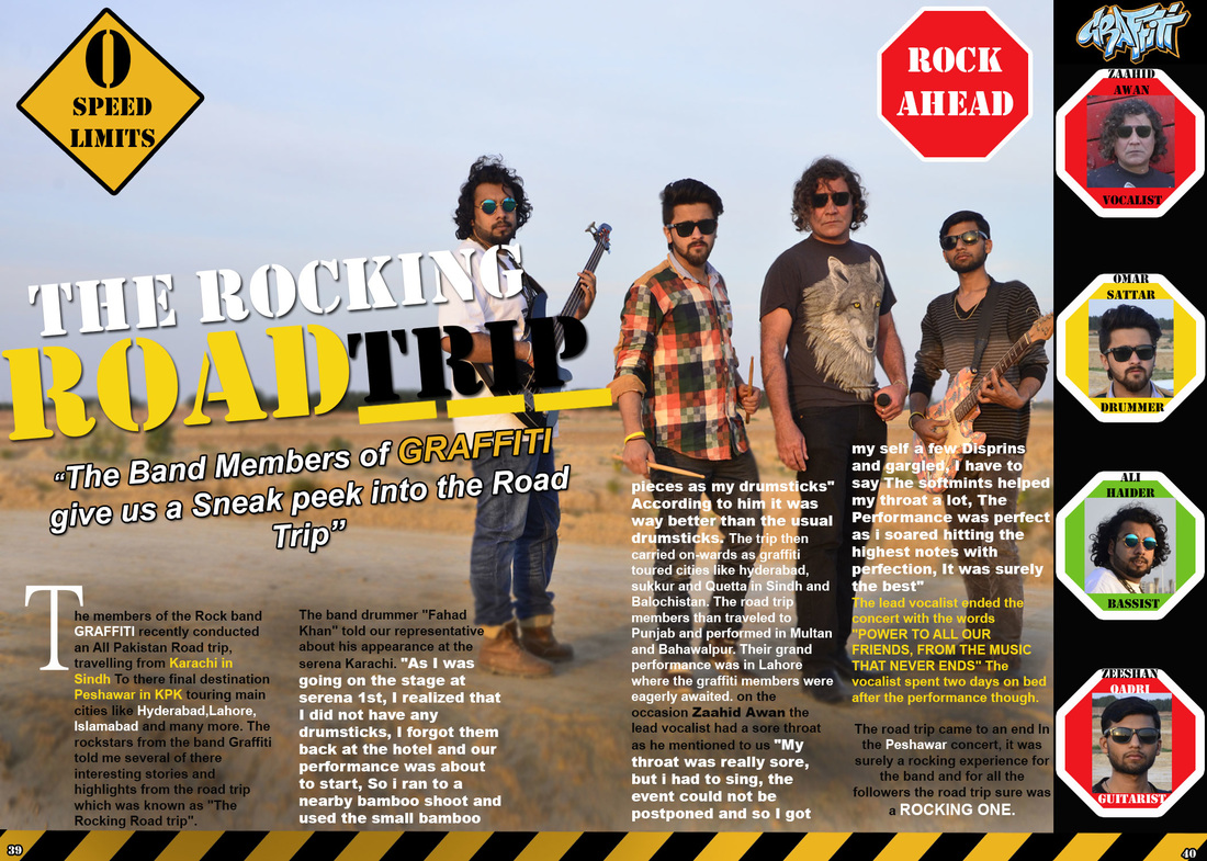 I really had to make a lot of changes to my Double page spread, and finally I'm quite satisfied with it, i added a lot of graphic elements, and road graphics as well after the advice of my teacher, then i also sorted out the color scheme for the main body text and also decided to spread the text into 4 columns. the column on the right represents the band members and i tried to give the look of a traffic signal in which their pictures are posted.
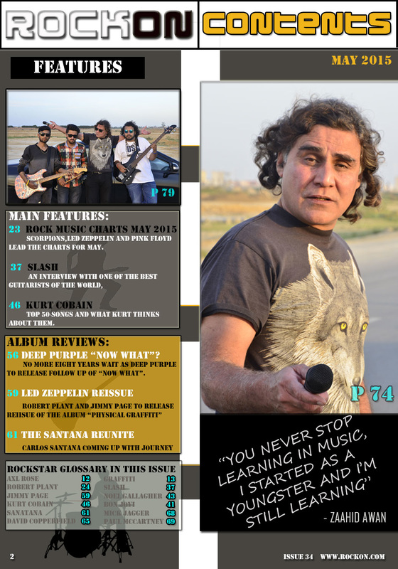 I made quite some changes to my contents page, to start of i gave a road like graphic in the background, as this issue features a road trip, secondly i made some significant changes to my color scheme and i also add some instruments in the background which are behind the contents, these show my creativity and give a good look to a music magazine.
|
AuthorI am Humble Awan and I'm a media studies student at Learning Alliance. I live in Pakistan and i love music and singing. Categories
All
Archives
June 2015
|


 RSS Feed
